The Beginner's Guide to Fountain Pen Nib Sizes: EF, F, M, B and Beyond
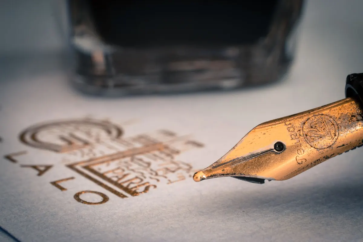
The letters on a nib box look like a code: EF, F, M, B, and then the odd ones — 1.1 stub, BB, soft fine. They all describe one thing: how much ink a nib lays on the page, and therefore how wide your writing comes out. Get that roughly right and a fountain pen becomes the easiest pen you own. Get it wrong and you will either scrape your way through a notebook or watch your letters merge into one another. This guide covers what the letters mean, how they feel, and how the paper you already own should shape your choice.
What the letters mean
Nib widths are measured in fractions of a millimetre at the tipping point, then rounded to a letter. From finest to broadest, the common grades are extra fine (EF), fine (F), medium (M), broad (B) and double broad (BB). Some makers add their own: soft fine, zoom, music, or an oblique cut for left-handers and calligraphers.
Then there is a separate family. Stub and italic nibs have a flat, rectangular tip rather than a round ball. Held at a normal writing angle, the downstrokes come out broad and the cross-strokes narrow, which gives your writing a calligraphic look with almost no effort. Flexible nibs do something different again: press lightly and you get a fine line, press a little more and the tines spread, widening the stroke.
One warning before you buy. These letters are not an international standard. Japanese nibs from Pilot, Platinum and Sailor run noticeably finer than European ones from Lamy, Kaweco or Pelikan. A Japanese fine can be as narrow as a European extra fine. Always read the width in millimetres, or search for handwriting samples from the exact pen you are considering.
Line width in practical terms
As a rough guide, here is what the grades usually produce on decent paper:
- Extra fine: about 0.25–0.35 mm. Hairline writing, small loops, tiny form boxes.
- Fine: about 0.35–0.45 mm. The safe choice for small handwriting and cheap paper.
- Medium: about 0.45–0.6 mm. The all-rounder most pens ship with.
- Broad: about 0.6–0.8 mm. Confident, generous strokes.
- Double broad: 0.8 mm upward. Signatures, headings, envelopes.
- Stub or italic: often 1.1 mm or 1.5 mm, though the line changes thickness within every stroke.
Treat those figures as ballpark. Two brands can differ by a full grade under the same letter, and ink flow shifts the line further — a wet ink in a medium nib can behave like a dry broad. If your letters are small, or you write in a tight, upright hand, a medium nib will close up your loops and blur your word spacing. If you write large and loose, a fine nib can look thin and spidery on the page.
Smoothness is a separate question
Beginners often assume broader equals smoother. That is only half true. A wider tipping spreads contact across more paper fibres, so it glides and forgives a slightly uneven hand. It also shows off ink colour, shading and sheen far better than a fine line, simply because there is more ink on the page to look at.
Fine nibs give more feedback — a faint sense of the paper's texture through the barrel. That is not a fault. Feedback is useful: it slows your writing just enough to keep your hand steady, and it makes small handwriting legible. Genuine scratchiness is different. It usually means the two tines are misaligned, or you are pressing too hard rather than letting the pen do the work. A fountain pen needs almost no downward pressure; if you are gripping it like a biro, the nib will dig in.
Feedback tells you where the paper is. Scratchiness tells you to stop and look at the nib under a loupe.
Why UK paper changes your choice
Paper is where a nib choice is either confirmed or ruined, and British stationery cupboards are a mixed bag. Office copier paper is thin and absorbent. Ink spreads along the fibres instead of sitting on the surface, so a fine line feathers into something fatter, and a broad nib bleeds straight through to the next sheet. If most of your writing happens on that paper, err on the fine side and choose a drier ink.
Good notebook paper behaves quite differently. The smoother, heavier stocks from Clairefontaine, Rhodia and Oxford's Optik range hold a crisp edge, resist bleed-through and let a broad nib show what it can do. Laid and textured writing papers — the sort you use for letters — add tooth of their own, which a fine nib will feel and a medium will shrug off.
A few practical habits help:
- Test a new pen on your everyday notebook, not on the best paper in the house.
- If you must write on forms printed on thin paper, keep a fine or extra fine pen for the job.
- Bear in mind that ink and nib work as a pair: a wet ink in a fine nib can still feather on poor paper, while a dry ink in a broad nib stays tidier than you would expect.
- Use a sheet of blotting paper or a folded card under your hand if you write with a broad nib in a notebook — it stops smudging and keeps the opposite page clean.
Matching the nib to the job
Most people end up with two or three pens for different tasks, and that is a sensible place to land:
- Lectures, meetings and marginal notes: fine or extra fine, for speed and small paper.
- Journaling and letters on decent paper: medium, which suits most handwriting and shows ink off well.
- Signatures, greetings cards and envelopes: broad or double broad for presence.
- Headings and labels: a 1.1 mm stub, which makes ordinary block capitals look deliberate.
- Cheques, forms and tight grids: extra fine, and check the ink is a sensible colour for the purpose.
How to choose without guessing
- Start with a medium unless your handwriting is small or your paper is poor — in either case, start with a fine.
- Buy a pen whose nibs swap easily, or a second nib unit for the pen you already own. Lamy, Kaweco, TWSBI and several others make this straightforward.
- Keep the ink and the paper constant while you test. Change one thing at a time or you will learn nothing.
- Write a few lines at your normal speed and size. Slow, careful lettering flatters every nib and tells you nothing about daily use.
- Give it a week. Nib preference is partly habit, and a fine nib that feels odd on day one often becomes the one you reach for.
A practical starting point
If you are buying your first fountain pen and cannot decide, choose a medium, fill it with a mid-range ink such as one from Diamine, and write on the paper you actually use. Then buy a fine or extra fine nib for the same pen a month later. Two nibs and one bottle of ink will teach you more about width, smoothness and paper than any amount of reading, and they will tell you exactly which direction to go when you buy your second pen.
Keep a note of what felt right on which paper. Fountain pens reward that small bit of attention, and within a few weeks the letters on the box will stop looking like a code and start looking like choices.
Photo: Pixabay / Pexels